
18 March 2025
A Gentle Introduction to Flamegraphs
What flamegraphs are, how to read them, and why they've become my favourite tool for understanding where time is actually spent in production.
I don’t trust intuition when it comes to performance. Not mine, not anyone’s. The method you’ve been suspicious of for two years? Probably fine. The line nobody looks at? Probably the problem.
Flamegraphs are how I stopped guessing.
A brief history
Flamegraphs were invented by Brendan Gregg in 2011 while he was debugging a MySQL performance issue at Joyent. The traditional profiling tools he was using produced walls of text - stack traces with sample counts that were impossible to scan visually. He needed a way to see the whole picture at once.
His insight was to take sampled stack traces and visualise them as nested rectangles, where the width of each rectangle represents how often that function appeared in the samples. He chose warm colours to make busy code paths look “hot” - and the name stuck. For examples of his original interactive SVG flamegraphs, see his CPU Flame Graphs page.
How to read a flamegraph
Four things to know:
- The Y-axis is stack depth. Each layer is a function call. The bottom is the entry point; the top is the leaf function where time was actually spent.
- The X-axis is NOT time. Frames are sorted alphabetically - a function on the left didn’t run before one on the right. What matters is width: a frame’s width shows what proportion of samples included it.
- Width is everything. Wide bar = lots of CPU time. Narrow bar = not much. Look for the wide ones.
- Colour is noise. In most tools, colour is random or indicates frame type (kernel vs. user). Don’t read meaning into it.
Here’s what a real flamegraph looks like in Vernier. This is the flamegraph view - the classic Brendan Gregg layout with root at the bottom:
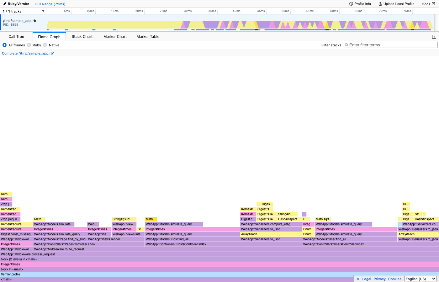
Think of it like a floor plan - the rooms taking up the most square footage are the ones worth investigating.
The four optimisation strategies
Before we go further, here’s the framework I use for every performance fix. Once a flamegraph shows you the bottleneck, there are really only four things you can do:
- Don’t do it - Remove the work entirely. The best optimisation is deleting code.
- Do it less - Cache results, batch operations, add short-circuit conditions.
- Do it later - Defer to a background job, lazy evaluation, or a deferred request.
- Do it with less work - Better algorithm, fewer allocations, more efficient data structure.
The biggest wins almost always come from strategies 1 and 2. The fanciest algorithm in the world can’t beat “don’t run this code at all.”
Last month, a flamegraph showed me a packages sidebar check was the most expensive thing on one of GitHub’s most visited pages. Nobody suspected it. The fix was strategy #1: delete the check entirely. 12 lines added, 65 deleted, 23% faster.
Flamegraph vs flame chart
These terms get confused constantly.
A flamegraph merges identical stack frames and sorts alphabetically. This gives you the clearest view of where your application spends its time overall. It’s the view I use for almost every investigation.
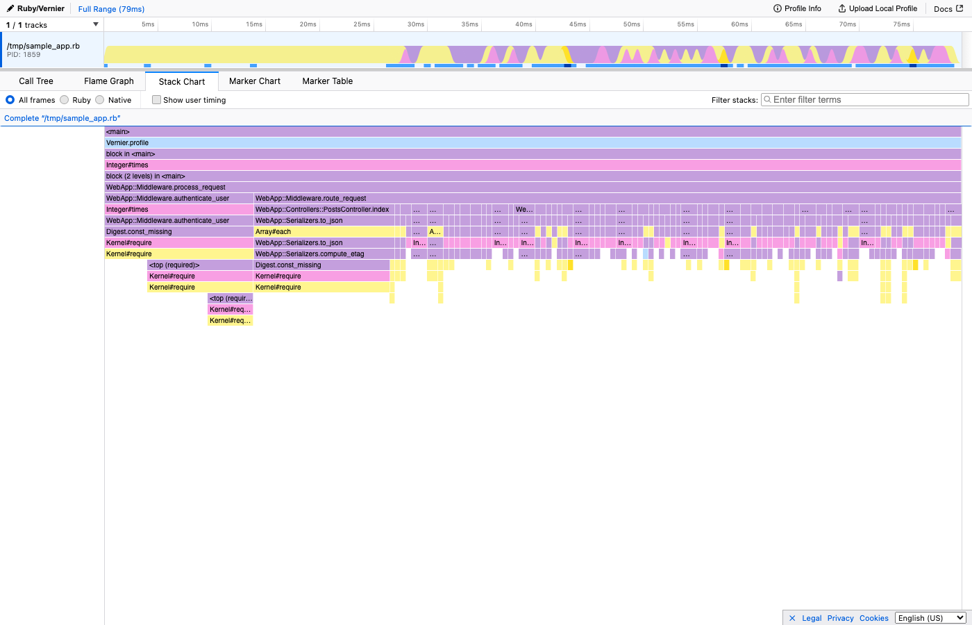
A stack chart keeps samples in chronological order. The X-axis is time. This is useful for understanding the sequence of events in a single request, but samples spread across a time axis instead of being merged, so individual frames become too narrow to read in longer profiling windows.
Here’s the same profile shown as a Stack Chart - notice how the X-axis is now time, and you can see the request flow from left to right:
Use the flamegraph (merged, alphabetical X-axis) for finding bottlenecks and understanding overall CPU usage. Use the flame chart (time-ordered X-axis) for understanding request flow in single-threaded analysis.
I default to the merged flamegraph view. If I need to understand when things happened within a request, I switch to the flame chart.
Profiling in Ruby with Vernier
If you’re working in Ruby, I’d recommend Vernier - a next-generation sampling profiler for CRuby. It requires Ruby 3.2.1+ and produces detailed profiles with very low overhead, safe enough for production.
require 'vernier'

Vernier.profile(out: "profile.json") do
  # your code here
end
Open the resulting JSON in vernier.prof, Firefox Profiler, or if you’re feeling adventurous, my own viewer.
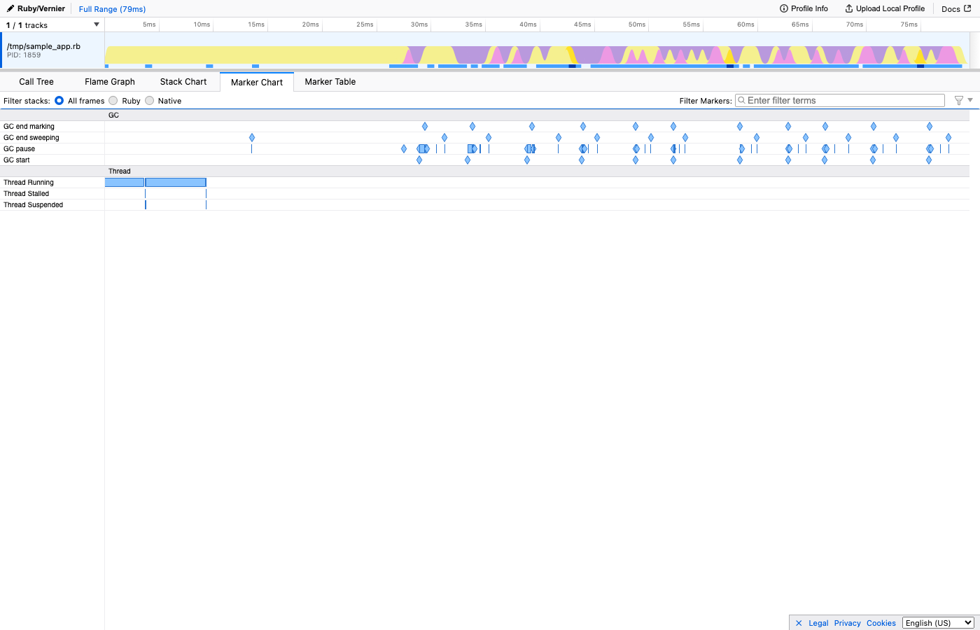
Beyond basic CPU samples, Vernier captures additional context as markers: GC events (when garbage collection ran and for how long), SQL queries (the actual SQL, with timing), and feature flag evaluations. These show up on a timeline alongside the flamegraph, so you can correlate CPU spikes with specific events. For example, you might notice that a particular SQL query triggers an expensive code path, or that a feature flag check involves a database lookup you didn’t expect.
Here’s what the Marker Chart looks like - you can see GC pauses, Active Record queries, view rendering, and circuit breaker checks all on one timeline:
How to find the bottleneck
When you open a flamegraph for the first time, it can feel overwhelming. Here’s how I approach it:
- Look for wide bars at the top. These are the leaf functions consuming the most CPU. They’re your prime suspects.
- Trace downward. Follow the wide bar down the stack to understand the call chain. Often the fix isn’t in the leaf function itself, but in a caller higher up that shouldn’t be invoking it so often.
- Look for things that shouldn’t be there. Sometimes the bottleneck isn’t something being slow - it’s something being present. A search query on a path that doesn’t need it. A serialisation step that runs even when the result is cached.
A note on precision: flamegraphs are based on sampling, which means they’re statistical. Very short-lived functions might not appear if they execute between samples. But for understanding where the bulk of your CPU time goes, sampling profilers are remarkably accurate - and their low overhead means you can safely run them in production, which is where the interesting problems live.
Getting started
You don’t need a massive production system to try flamegraphs. Profile your test suite. Profile a single request in development. Profile a script that feels slow.
The moment you see your first wide, hot bar at the top of a flamegraph - something you never would have suspected - you’ll understand why I’m so fond of them.
They remove the guesswork and shed light on what’s happening.
For a real-world example of this process in action, see how removing one query cut a page’s CPU by 23%.